Author: Adam
CSS: Blurry Text
Blurry Text Effect
Lesson 1: HTML Basics
Lesson 1
HTML Basics
HTML is the backbone of the Internet.
The HTML document is the heart, blood, and soul of websites. It’s the meat between the two hamburger patties. HTML is the pepperoni on pizza. An Internet void of HTML is like a book without pages. Now that you understand the importance of HTML, let’s start learning it, together.
The Document
The HTML document.
In this series, we’re going to explore the HTML document. You can either make a new HTML document, or go to my Github and download an HTML Document template. Click this link and select the Download ZIP button located on the right portion of the Web page. This downloads my entire “Learn Web Development” folder. Once downloaded, unzip the package by right-clicking it and choosing “Unzip”. Note: we’re just going to focus on the learn-html folder. So, open the learn-html folder and find the index.html file. Use a text-editor application to open this file. If you do not use a text-editor, double-clicking the file will simply open the index.html document in a web browser.
Tags
Headers, paragraphs, and links, OH MY!
Interactivity with Other Documents
HTML gets along great with CSS and JS documents.
Back to Intro to HTML
Forward to Lesson 2
Lesson 2: Selectors
Lesson 2
jQuery Selectors
Target and manipulate HTML elements
The selector is a crucial part of the jQuery statement. Selectors find and manipulate HTML elements. Luckily, these selectors are based off of CSS Selectors. Now that you’ve linked the jQuery library to index.html, you can start choosing some HTML elements to alter. Let’s begin with all of the <p> elements. Select all <p> elements by starting your code with:
$("p")
Great job so far! To recap, a selector is a reference to an HTML element that you put between the quotations. Now that we’ve singled out all paragraph elements, let’s add an action. Finish the statement by adding the .hide() action to the selector. The full phrase should look like this:
$("p").hide()
#id Selectors
Remember using the id tag in index.html? You can also point jQuery to id selectors just as you would in a CSS document.
$("#intro")
.class selectors
In addition to #id, the .class selector finds a specific class element within the HTML document.
$(".mast")
Tools
Check out this complete list of selectors by W3.
Back to Lesson 1: Syntax
Forward to Lesson 3
Lesson 1: Syntax
Lesson 1
jQuery Syntax
jQuery adds exciting events to websites
jQuery syntax selects certain HTML elements and assigns an action to those HTML elements.
$(selector).action()
Start the jQuery phrase with a $ symbol to tell the browser to access the jQuery library. Specify the HTML element in the (selector) portion. Then, choose a jQuery .action() to be associated with the HTML element.
For example, the following code will employ jQuery and hide all H1 elements in your HTML document.
$("h1").hide()
It’s that easy, and fun. There are many other things you can do with the HTML elements other than hiding them. We will explore some practical uses of jQuery events in another lesson.
Before we can move further, let’s get more comfortable with selectors and events.
Back to Intro to jQuery
Forward to Lesson 2: Selectors
Lesson 4: Positioning
Lesson 4
Positioning with CSS
Placing elements in various areas of the Web page.
Use the position property to position CSS elements. There are four main values that determine an element’s position:
Fixed
A fixed element remains in a certain area on the Web page, even when scrolling and resizing the window. You might use fixed-position to display important announcements.
The fixed value requires top, right, bottom, and left values. These four values dictate where the fixed element appears on the Web page. Let’s apply the class .fixedElement to a div
.fixedElement {
position: fixed;
bottom: 0;
right: 0;
width: 200px;
height: 100%;
background-color: grey;
}
In this instance, the HTML element with the class fixedElement will appear as a sidebar on the right side of the screen. I used this example to represent something similar to the Facebook chat sidebar.
Static
The static value is default CSS value, but it’s good practice to learn about it. Elements with the static value have no defined position on the Web page. Another way to say this is to call it a not positioned element. On the other hand, fixed, relative, and absolute values do have defined positions on the Web page, and are therefore called positioned elements.
.staticElement {
position: static;
}
Relative
The relative value is similar to the static value, until you add some extra frills to the relative value. So, let’s say that you’ve got two div containers—both with the position: relative; rule. The second container positions itself relative to its parent container.
.relativeFirst {
position: relative;
}

.relativeSecond {
position: relative;
top: -15px;
left: 15px;
background-color: grey;
width: 50%;
}
Absolute
The absolute value can sometimes be tricky. Absolute elements appear relative to the nearest positioned anchor. Think of the absolute value as it would apply to pepperoni on a pizza. Consider two divs with the class .pizza and .pepperoni. We’re going to position the div with a class of .pepperoni on top of the div with a class of .pizza. In other words, the position of .pepperoni is dependent on the .pizza position. In your CSS document, the rule for .pepperoni should immediately follow the rule for .pizza. (Remember, CSS code cascades downward, so rules are applied from the bottom up.)
.pizza {
position: relative;
width: 500px;
height: 250px;
}

.pepperoni {
position: absolute;
top: 100px;
right: 0;
width: 200px;
height: 200px;
}
Back to Lesson 3: The Box
Forward to Lesson 5
Lesson 3: The Box
Lesson 3
The Box Model
Everything on a Web page is inside a box.
CSS organizes elements on a Web page using many, many boxes. Take, for example, this blog. Go ahead and resize your browser’s window and watch what happens to the paragraph text in relation to the header. Does resizing the window cause the paragraph text and header to overlap? Or, does the page content dynamically change to accommodate the new window size? If all goes well, the website should remain readable and organized. This is the beautiful CSS code hard at work!
In this lesson, we’re going to learn about the following:
Now, let’s discover how and why CSS boxes are important to learn and practice. If you’re a visual learner, here’s a screenshot of this blog with added borders around all the CSS boxes. The header box is bordered in blue, the post content is bordered in red, and the sidebar area is bordered in purple.

Box-Sizing
Without going into the history of CSS, just know that it is important to add the following code to your CSS file so that the width of all boxes are defined by the <code>width</code> property. (In short, without applying the following code to your CSS file, the CSS boxes width might be affected by margin and padding, which is an older method.)
* {
-webkit-box-sizing: border-box;
-moz-box-sizing: border-box;
box-sizing: border-box;
}
Border
CSS boxes have invisible borders, but you can add a little bit of code to show the border and alter it’s appearance. Use the border property and add a width, style, and color value (in that order) to display a box border. We’re going to style the border of our div example.
- Border width is a pixel value (ex. 3px)
- Border style include:
- solid
- dashed
- double
- dotted
- none
- Border color is formatted as a #hexadecimal, RGB, HLS, or color name (ex. #3DADEE or blue)
Padding
Padding is the space between the content within a box and the box’s border. An easy way to remember this is to think of the bubble-padding you put inside a box before mailing a package.
Margin
Margins act as a buffer between the box (specifically the box border) and other content on the Web page.
Back to Lesson 2: Set Up the External Stylesheet
Forward to Lesson 4: Positioning
Lesson 1: CSS Basics
Lesson 1
CSS Basics
CSS is a compact, yet powerful language.
It brings colors, font styles, boxes, and style to websites. To get started, we’re going to take the first few steps together and set up a very simple website and employ a couple common CSS styles. In this lesson, we will use an HTML file and a CSS file.
Cascade
CSS code is written in a cascade-like document. What does the word cascade mean? Well, outside of computing, cascade refers to a waterfall descending over a hill or cliff. Similarly, CSS code is organized in a cascading style.
Rule Priority
Take, for example:
h1 {

color: red;
font-size: 14px;

}

h1 {

color: black;
font-size: 12px;

}
But wait, there are two rules that apply to H1 elements, so which one will be applied? Well, web browsers will notice the first CSS rule, instructing the browser to apply a red, 14 px style to all Heading 1 text. However, because there is a second CSS after the first CSS rule pointing towards H1 text, the rule closest to the bottom of the document takes precedence. So, all H1 elements will be colored black and a 12px font size. This is a great example of the cascade in action, the code waterfalls from top to bottom.
Common Values
With CSS, you can change many HTML elements on a web page. Commonly used CSS property values include: color, size, and position.
Color
Color is defined by hexadecimal, RGB, or HSL values.
Hexadecimal
A hexadecimal is a combination of six characters that define red, green, and blue hues. For example, #DD463C represents a light red, mixed with hints of orange and pink. You can use the Color Wheel tool by Adobe to mix and match different colors.
Using a hexadecimal value looks like this:
p {
background: #DD463C;
}
RGB
Red, green, blue. The following RGB outputs a blue-green shade.
p {
background: rgb(13, 255, 201);
}
Size
Length is determined using either absolute sizing, pixels, or relative sizing, em & percentages.
Pixels
A pixel is a unit of measurement equivalent to 1/96th of an inch, therefore there are 96 pixels in 1 inch. Using pixels as a unit of measurement is a safe bet and ensures that a precise size will be used.
p {
font-size: 12px;
}
Em
With the changing landscape of Internet-enabled devices, it is beneficial to become familiar with the benefits of relative sizing, like the Em and percentage values. Em is a typographic unit that sizes an element relative to its parent font-size. For example, a footer-module that has a font size of 15px and a width of 2em, the width of the element is 15(px) multiplied by 2(em) = 30 pixels.
.footer-module {
font-size: 15px;
width: 2em;
}
Percentage
The percentage-value is one of the most popular methods of sizing elements in CSS. The percentage value sizes an element based on the size of its parent element. So, if the size of a .module element is 100px and a .box element located within the .module element is set to width: 50%, then the .box element would be 50% of 100 pixels. Thus, the .box size is 50 pixels.
.box {
width: 50%;
}
Back to Intro to CSS
Forward to Lesson 2: Set Up the External Stylesheet
Lesson 2: Set Up the External Stylesheet
Lesson 2
Use an External CSS Document
Create a New CSS External Stylesheet
The very first step to implementing CSS into your website is to create the CSS document using a text editor. On Mac computers, TextEdit is preinstalled. Alternatively, you can download Atom.io or Sublime Text. From your text editor, click File » New. Then, save this blank document as main.css. (You can also choose any other file name you’d like, as long as the file extension is .css) Now, click File » New and create another blank document called index.html.
Index.html is where your website content will go, but for now we’re just going to insert the link to our external CSS file. Add the following code to your index.html or click here to download the example index.html that I created for this lesson. If this is your first time working with CSS as it relates to HTML, try copying the code for muscle memory.
<!doctype html>
<head>
<title>A Website Name</title>
<link href="css/main.css" rel="stylesheet">
</head>

<body>
</body>

</html>
Here’s what you need to pay attention to:
<link href="css/main.css" rel="stylesheet">
HTML and CSS Document “Friendship”
Great. Now the fun begins. To recap, we’ve got an HTML file and CSS file, and the HTML document now checks the CSS file to see which styling it should apply to the website content when loading the page. To visual this, remember that when a web browser loads a website, the highest priority is the actual content. Then, the browser says “Okay, now that I’ve loaded the website content, should the font color be different anywhere? Are the font sizes different than usual? Where should I align this picture within the paragraph?” CSS helps the web browser “dress” up your website content.
Back to Lesson 1: CSS Basics
Forward to Lesson 3: The Box
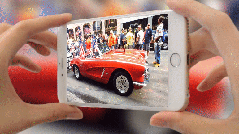
This App Lets You Take “Spatial Photography”
A New Era of Photography is Here
A Brief History

In September 2015, Apple announced a new, interactive way to take photos called Live Photos. Since then, many mobile apps have sprung up to address the creative needs that iPhones users want; and it’s called “3D Photography”.
Fyuse, a Spatial Photography App

In a world where photography and videography are no longer flat, Fyuse introduces a new type of media experience. This mobile application gives you the ability to transform a moment in time into an interactive picture. For example, let’s say that you want to purchase a new pair of shoes on Amazon.com. Naturally, you would look at the product photos and reviews. With Fyuse, retailers can display products in an additional dimension, providing customers’ with a better understanding of the product.
How To Download Fyuse
As of February 2016, Fyuse is available on iOS and Android-powered smartphones. To download Fyuse, visit the Apple App Store or Google Play Store and click the Download button.
Growing Interest in Virtual Reality
Unsure of what kind of virtual reality, or VR, gadgets are on the horizon, we are witnessing the birth of an exciting new era of interconnectivity. It almost seems as if media—pictures and video—is beyond the infrastructure of consumer-grade VR devices. Meaning, watching video of stepping into another world is currently a possibility (see 360* videos from around the world) and yet we’re still using 2D platforms to engage with the VR world.
Other Thoughts

I first discovered Fyuse when I saw a member of my family’s post on Facebook. He was on a ski trip and uploaded a Fyuse while standing on the snowy mountain summit. It looked incredible. However, I immediately wondered how this app could be different from the Facebook 360 Video feature that rolled out in 2015. The biggest difference: Fyuse focuses on snapshots, or moments in time, whereas Facebook 360 brings a fully immersive experience to video media.
Media Citations
Featured Image courtesy of Fyu.se. Retrieved 27 February 2016.
Live Photos on Apple iPhone sourced from First Click: Live Photos could be Apple’s most disruptive new announcement by Thomas Ricker. Retrieved on 27 February 2016.
Facebook 360 Video sourced from TechCrunch Facebook Brings VR-Style 360-Degree Video To News Feed by Josh Constine. Retrieved on 27 February 2016.
 Adam Lawicki